UX Case Study
Artinerary
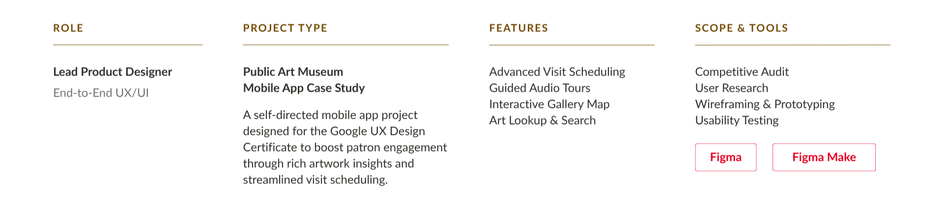
Art Museum Mobile App
Project Overview
Competitive Audit
To initiate my research, I conducted a competitive analysis of four prominent art museum apps: the Art Institute of Chicago, Smartify, Bloomberg Connects, and the Getty Guide. This analysis focused on evaluating the strengths and weaknesses of each competitor across key factors such as ease of use, design aesthetics, and feature set.
The Art Institute of Chicago and the Getty Guide were identified as our primary competitors, offering direct competition within the museum app space. Smartify and Bloomberg Connects were considered indirect competitors, offering broader art discovery platforms with overlapping features.

CORE PROBLEM
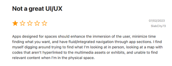
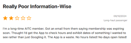
Art museum patrons struggle to explore exhibitions and plan their visits because existing platforms are cluttered and fragmented, forcing users into frustrating external redirects for ticketing and scheduling rather than offering a seamless, in-app experience.
Design Strategy
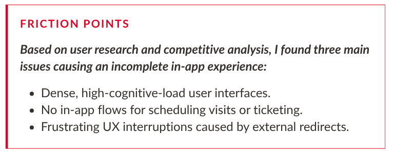
Based on my findings, I identified three key design opportunities — each directly addressing a friction point uncovered during research.

Mapping the User Journey
Following my competitive audit and user research, I developed user personas and journey maps for each. These maps helped me identify key pain points and opportunities, ultimately guiding my design decisions.
Click to Enlarge
Click to Enlarge
Click to Enlarge
Click to Enlarge
Click to Enlarge
Storyboards
As part of my design thinking process, I created storyboards to visualize Deven's user journey. These storyboards, which included both a "big picture" and a "close-up" view, helped me empathize with Deven's needs and identify opportunities to create a user-friendly and valuable product experience.
Big Picture
Click to Enlarge
Close-Up
Click to Enlarge
Information Architecture
As a foundational step, I created an information architecture for my Artinerary application. This involved careful consideration of user needs and pain points, ensuring a well-structured and logically organized content framework before proceeding to wireframe design.
The Design *
The Design *
Paper Wireframes
Digital Wireframes
Low-Fidelity Prototype
Paper Wireframes
To explore various design options for my homepage, I developed five distinct wireframes. Through this iterative process, I tested multiple home feed layouts and search placement ideas to determine how visitors naturally parse museum news vs. exhibit discovery.
Digital Wireframes
Informed by the initial concepts explored in my paper wireframes, I utilized Figma to create interactive digital wireframes. I employed best practices in UI/UX design, such as using clear visual hierarchy and adhering to established design principles, to refine the user experience and ensure polished wireframes to take into my low-fidelity prototype next.
Onboarding
To initiate the design process for the Artinerary app, I began by creating digital wireframes for the onboarding experience. This crucial first interaction sets the tone for the user's overall experience with the app. The onboarding flow begins with a visually engaging welcome page, followed by a language selection screen for accessibility and inclusivity. Users are then guided through the registration or login process, followed by a clear and concise presentation of notification settings to personalize their experience.
The final step in the onboarding process is a prompt to enable location services. This permission allows the app to provide personalized recommendations, such as upcoming events, and enhance the user experience with location-based features like guided audio tours and an interactive map.
This carefully designed onboarding experience aims to provide a seamless and user-friendly introduction to the app's features and functionalities.
Homepage & Subpages
Following the creation of digital wireframes for the onboarding journey, I proceeded to design wireframes for the core functionalities of the app: homepage, collections, artists, exhibitions & events, audio tours, artwork lookup, visit information, map, user profile, and search. This iterative process allowed me to refine the overall user flow and ensure a consistent and intuitive user experience throughout the app and will serve as guides for my final prototype.
Low-Fidelity Prototype
With my digital wireframes complete, I leveraged Figma's prototyping capabilities to define interactions. To ensure efficiency and maintain consistency, I built reusable components for the header, footer, and hamburger menu, streamlining the process and minimizing redundant interactions.
I also implemented overlay components for the individual hamburger menu options and the search interface
Usability Testing *
Usability Testing *

Artinerary Research Study
-
Assess the user experience of interacting with the Artinerary app prototype.
Determine the overall satisfaction and ease of use of the core functionalities.
Identify any pain points or areas of frustration for users during interaction.
-
What is the average time taken by users to successfully find and book tickets to an event within the app?
What are the most common user flows observed when scheduling museum visits in advance within the app?
At which points in the user flow do users experience the most difficulty or confusion?
What additional features would users find most valuable in the museum app?
What are the specific aspects of the app that users find particularly easy or difficult to use?
-
Time on task: how much time users spend booking tickets within the app
User error rates: how often users get stuck trying to complete the core functionalities of the app
System Usability Scale (SUS): a questionnaire to evaluate user feedback
-
Unmoderated usability study
Location: United States, remote (each participant will complete the study in their own home)
Length: Each session will last 15 to 20 minutes, based on a list of prompts, with a SUS following the study
Compensation: No compensation
-
Participants are all art museum visitors
The sample will aim for diversity, including individuals of varying ages (20-65), genders (male, female, non-binary), and levels of technology experience.
The Setback & Pivot
Usability Score & Navigation Restructure
High-Fidelity Prototype *
High-Fidelity Prototype *
Design System & Visual Foundations
Visual Arts Foundation: Leveraged background in visual arts to build a cohesive, accessible UI system using precise typography, crisp grid layouts, and intentional color theory.
Scalable Architecture: Developed reusable components and responsive layout modules in Figma to ensure design scalability for seamless developer handoff.
Accessibility First: Executed rigorous quality checks against WCAG standards to ensure high usability across all digital touchpoints.
Hi-Fi Solution #1
In-App Ticketing & Scheduling
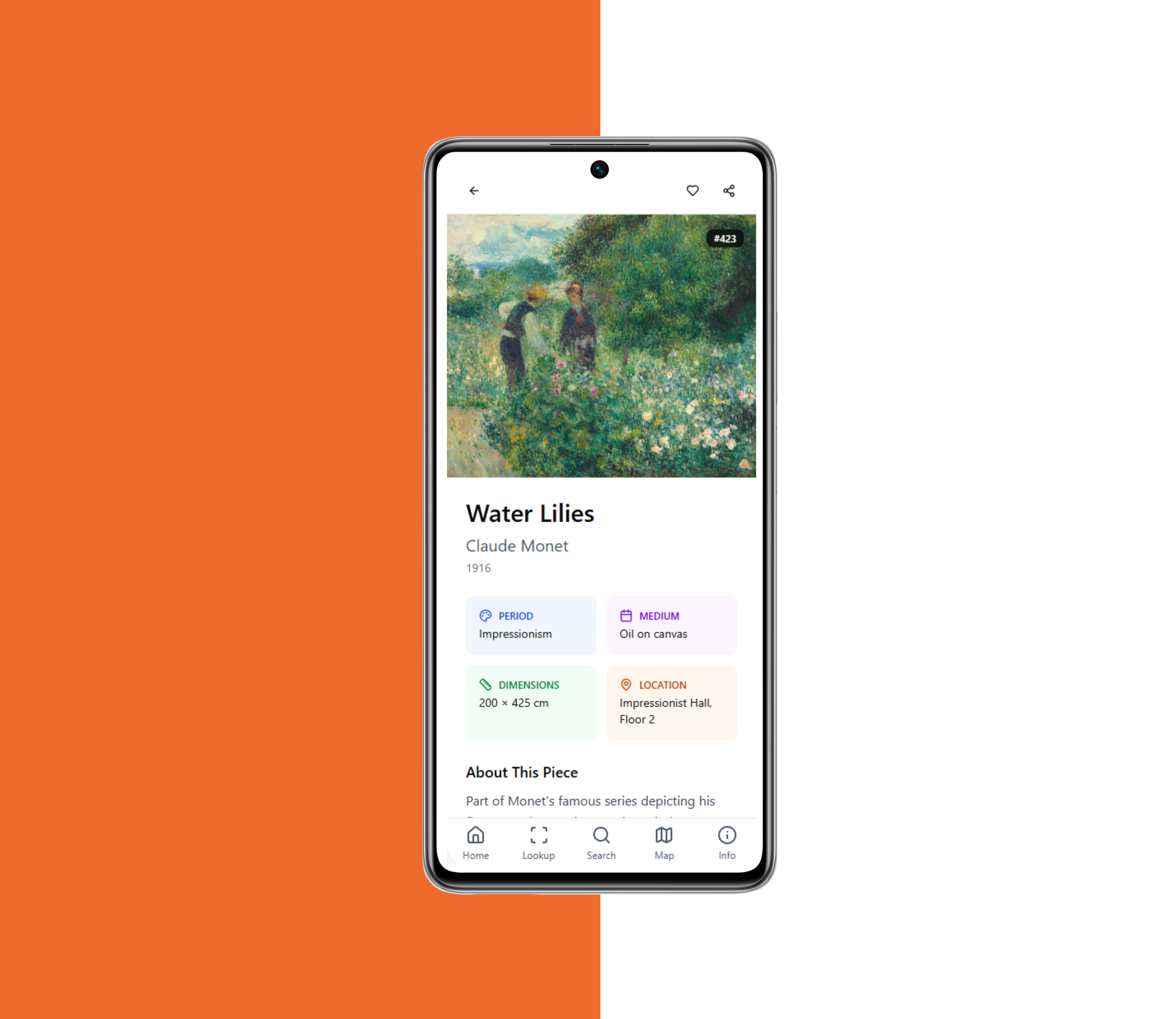
Native booking flow allowing users to pick dates, select ticket types, and get a digital confirmation pass — no external browser redirects.
Hi-Fi Solution #2
In-Gallery Artwork Lookup & Guided Audio Tours
A dedicated "Lookup Art" tool where typing a simple 3-digit plaque code pulls up instant background context and streaming audio guides.
Hi-Fi Solution #3
Art Discovery & Search
An intuitive search interface featuring recent search history, real-time keyword suggestions, and clear zero-state guidance to help patrons quickly explore the collection.
Impact & Future Roadmap
Reflection & Design Philosophy
What I Learned
A 66.25 SUS score isn't a failure — it's a compass pointing exactly where to iterate next.
Seeking out honest user critique is the single fastest way to unlock better design solutions.
Static prototypes can't reveal every edge case — continuous, real-world testing is essential.
Great products aren't built in a vacuum; cross-functional alignment with developers and stakeholders turns cool ideas into ship-able solutions.