UX Case Study
Bridging the Gap Between Discovery and Purchase
Amazon List Redesign
Tools Used
Figma Make + v0
Google Vids (prototype walkthrough)
The Challenge
Amazon’s current list feature suffers from "discovery friction." The entry point is buried deep within product pages, and the management interface feels like a legacy database rather than a modern shopping tool. For users, this leads to forgotten items and abandoned carts; for Amazon, it’s a massive loss in potential revenue.
The Solution
I used both Figma Make and v0 to create initial prototypes of the redesigned the list experience to be frictionless. By introducing a high-visibility "Heart" interaction, it simplifies multi-list organization. The results are prototypes that transform a static list into an interactive, organized, and shareable shopping hub.
Current List Feature
The "Add to List" CTA currently suffers from poor visual hierarchy on both desktop and mobile, requiring excessive scrolling and high cognitive load to locate. On mobile, the button’s proximity to "Add to Auto Buy" creates a high error rate (the "fat finger" effect), potentially leading to accidental purchases and user frustration.
Desktop
Mobile
Figma Make Redesign
Leveraging Figma Make’s generative capabilities, I rapidly moved from ideation to a high-fidelity functional prototype. This streamlined workflow allowed me to focus on validating core user flows and solving high-friction pain points. While this version serves as a robust MVP (Minimum Viable Product), it establishes a scalable design system ready for future high-polish iterations and A/B testing.
Implemented a prominent, animated Heart Icon on all product cards. Using Figma Make’s prototyping, I ensured instant visual feedback (color fills and count badges) to validate user actions without taking them away from their browsing flow.
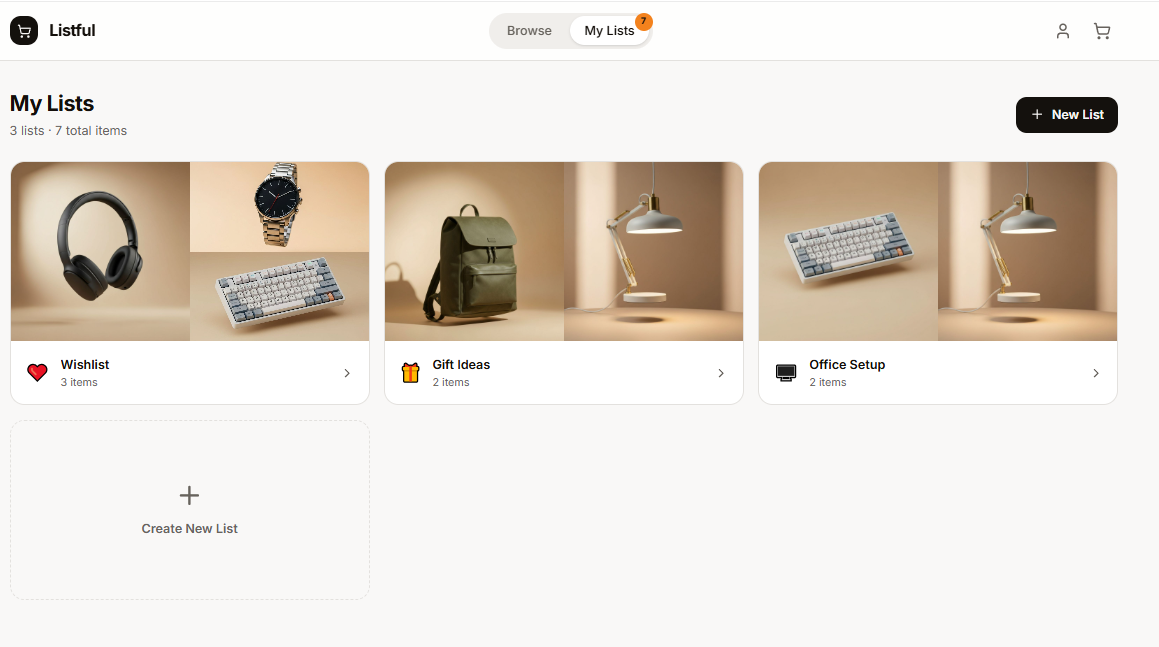
Developed a Smart Selection Popover that allows users to sort items into specific categories in two clicks. The clunky full-page reload was replaced with a Slide-out Interface, featuring bulk actions and real-time total value calculations.
v0 Redesign
v0 had a similar take on the list redesign after I inputted a few pain points with the current design. It incorporated a Heart Icon on each product card and had an almost identical “Save to Lists” feature.
While the current prototypes focus on fixing immediate friction, the next evolution involves Visual Curation. Leveraging the layout logic of platforms like Pinterest, I propose a 'Recommended for You' board that simplifies item discovery beyond the cluttered home page experience that exists currently. This would move the Wishlist beyond a simple 'Save for Later' tool and into a proactive, inspiration-driven shopping experience.